User Tools
Sidebar
DRAWER
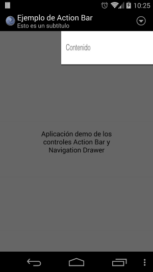
A drawer, is a group of controls invisible until it is taken out by dragging with the finger from one of the side edges of the screen.
The drawer group can be deployed while we are in any group of the collection.
When the drawer is deployed, what is behind is applied a semitransparent layer that darkens the background. When clicking on the semitransparent layer the drawer is hidden.
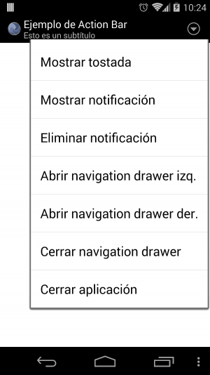
From the 3.16.64 version of the Android framework, the <navigationdrawer> and <actionbar> nodes can be defined to show a new type of menu. At the moment only is available for the Android framework.
These nodes can be defined in the companies collection and so they will be shown in the whole application. If the node already exists in another collection, it will have preference over the one from the companies collection when it is shown.
 |  |
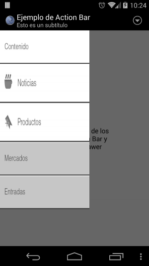 |  |
Navigation drawer
The navigation drawer is a sliding menu that can be shown by dragging from the left or right margin of the screen, or by using its corresponding script method.
It may be two <navigationdrawer> nodes at the same time if we want to have a menu on each side of the screen.
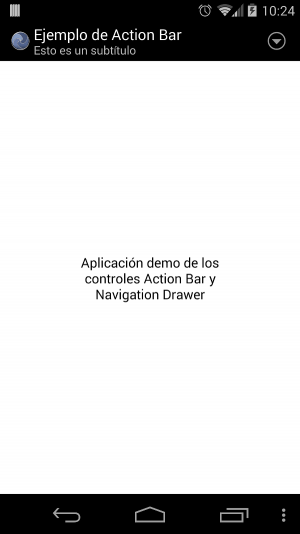
Action bar
This control only available in versions higher than Android 3.0 Honeycomb.
An <actionbar> is a menu that is shown in the top of the screen with a size automatically set to the screen.
Example of code #1
Page Tools
